FIGMA LO-FI
DESIGN
SYSTEM
Tool: FIGMA
Client: N/A
Role: USER EXPERIENCE, USER INTERFACE DESIGN
DELIVERED: A DESIGN SYSTEM
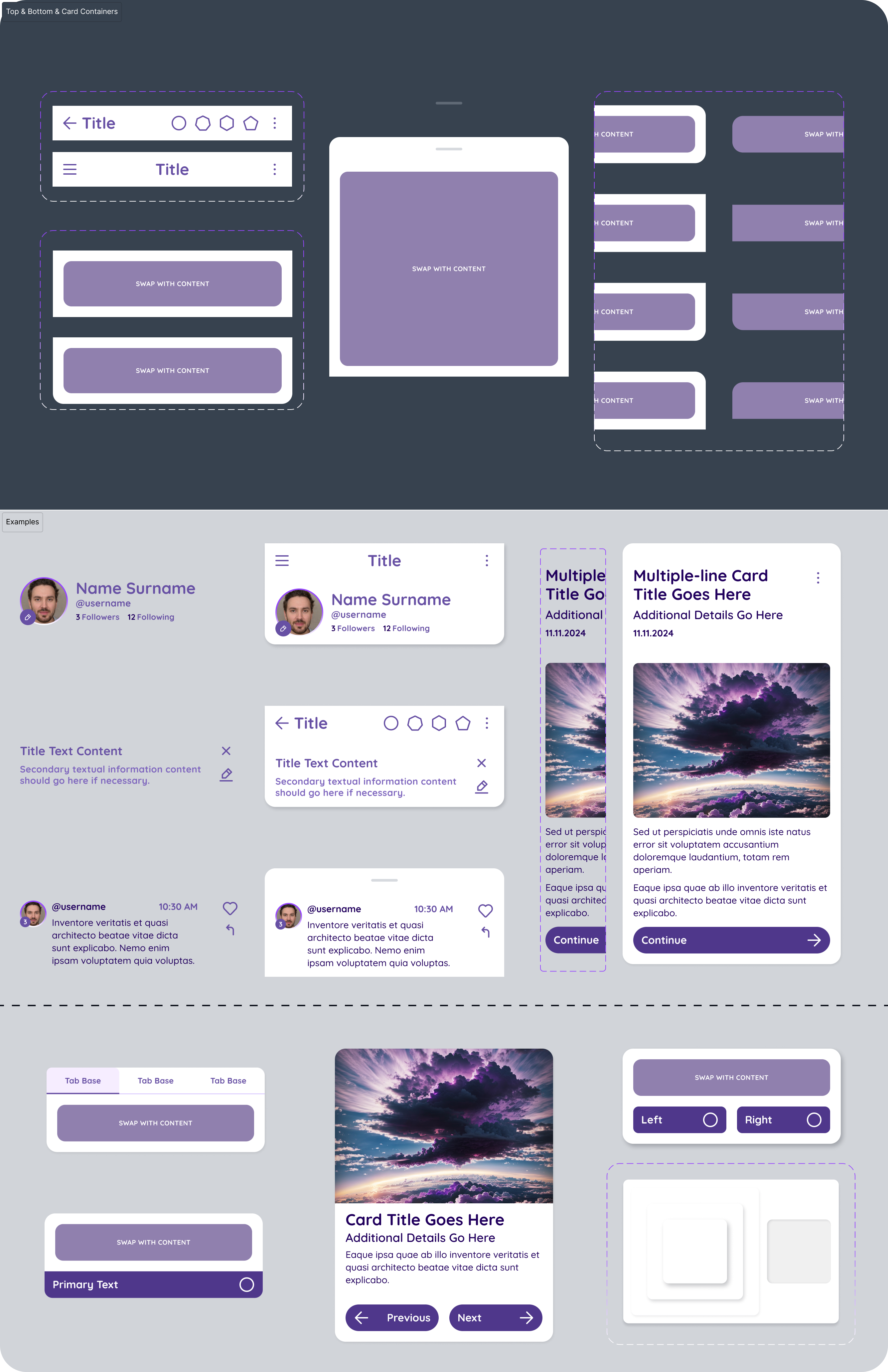
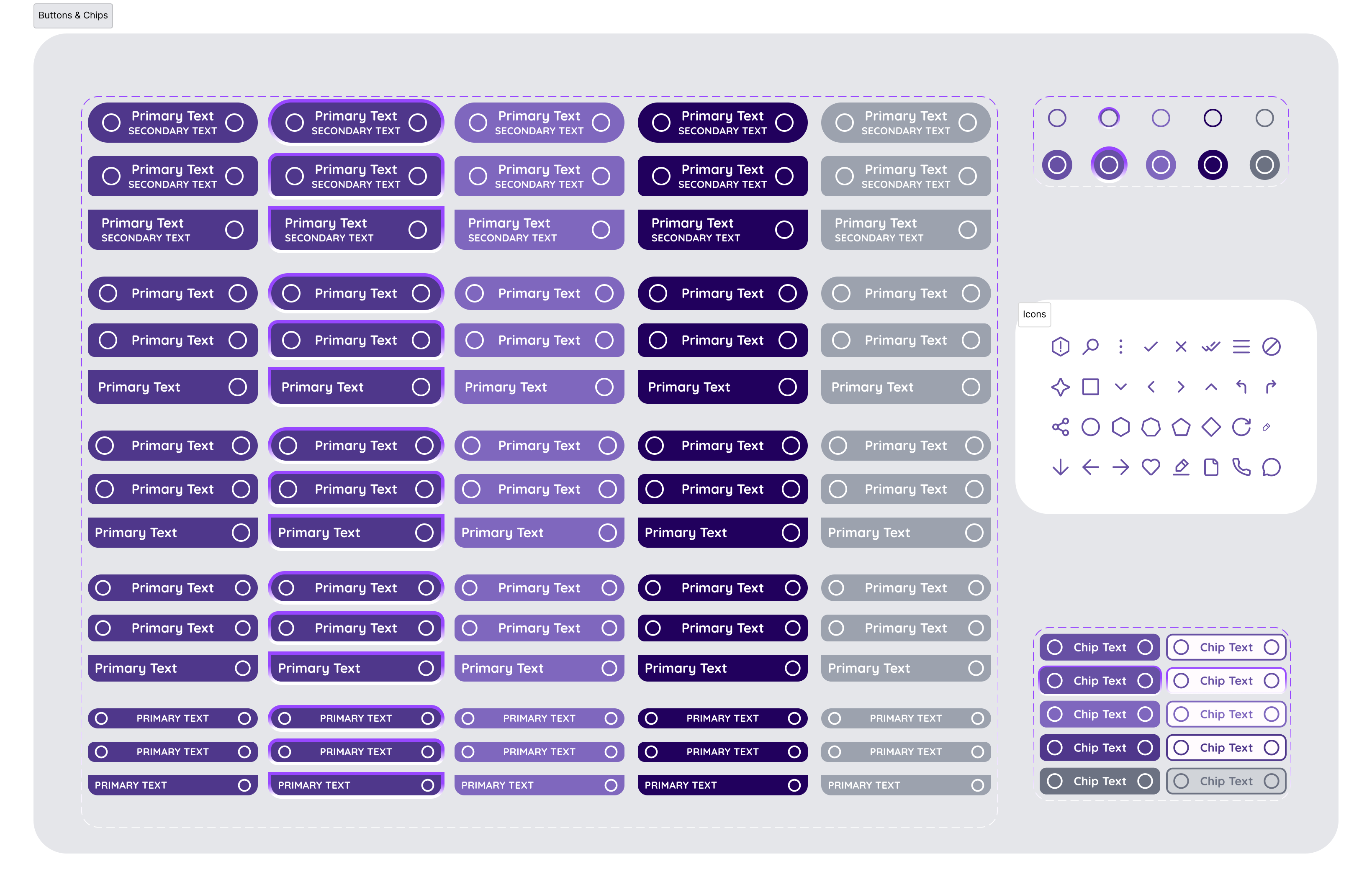
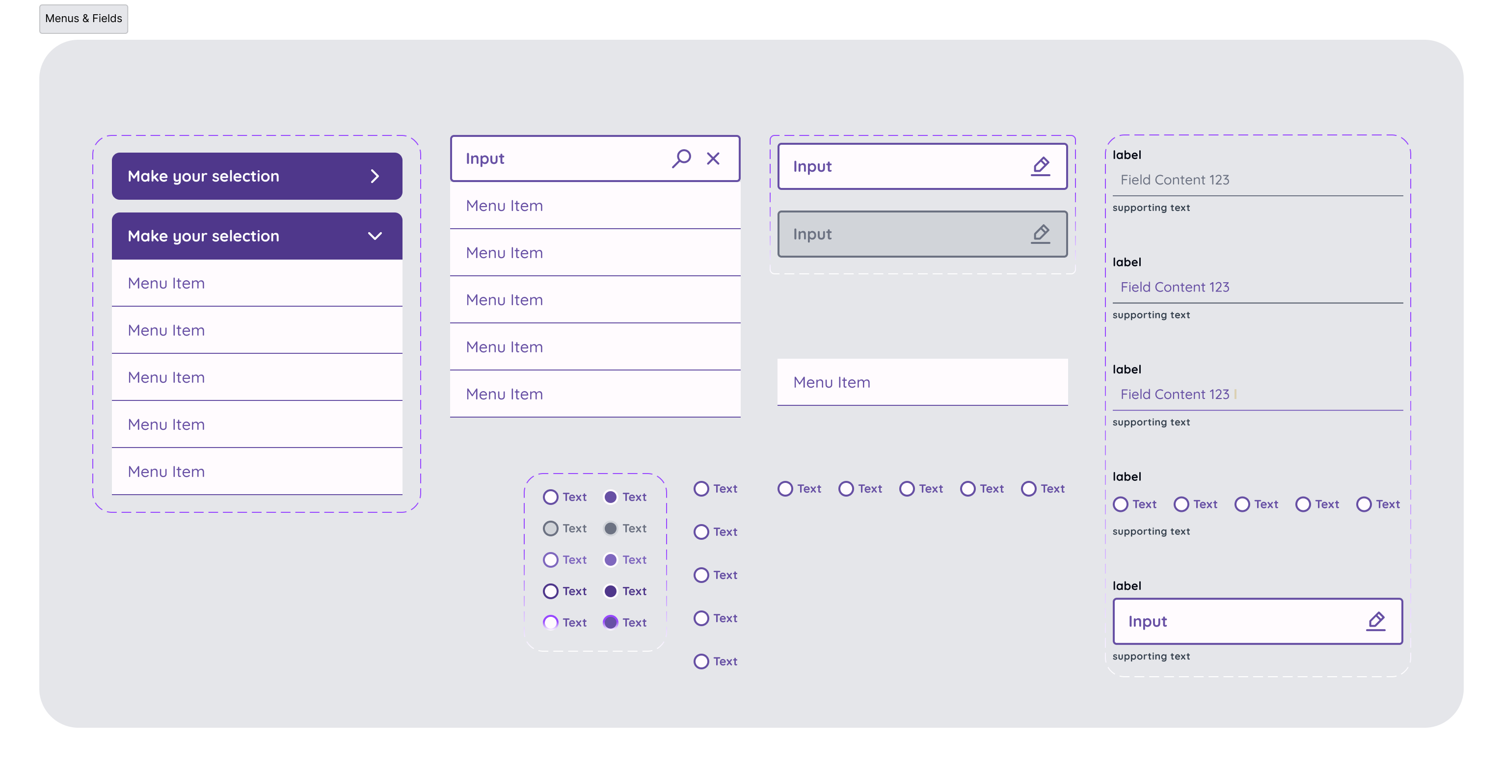
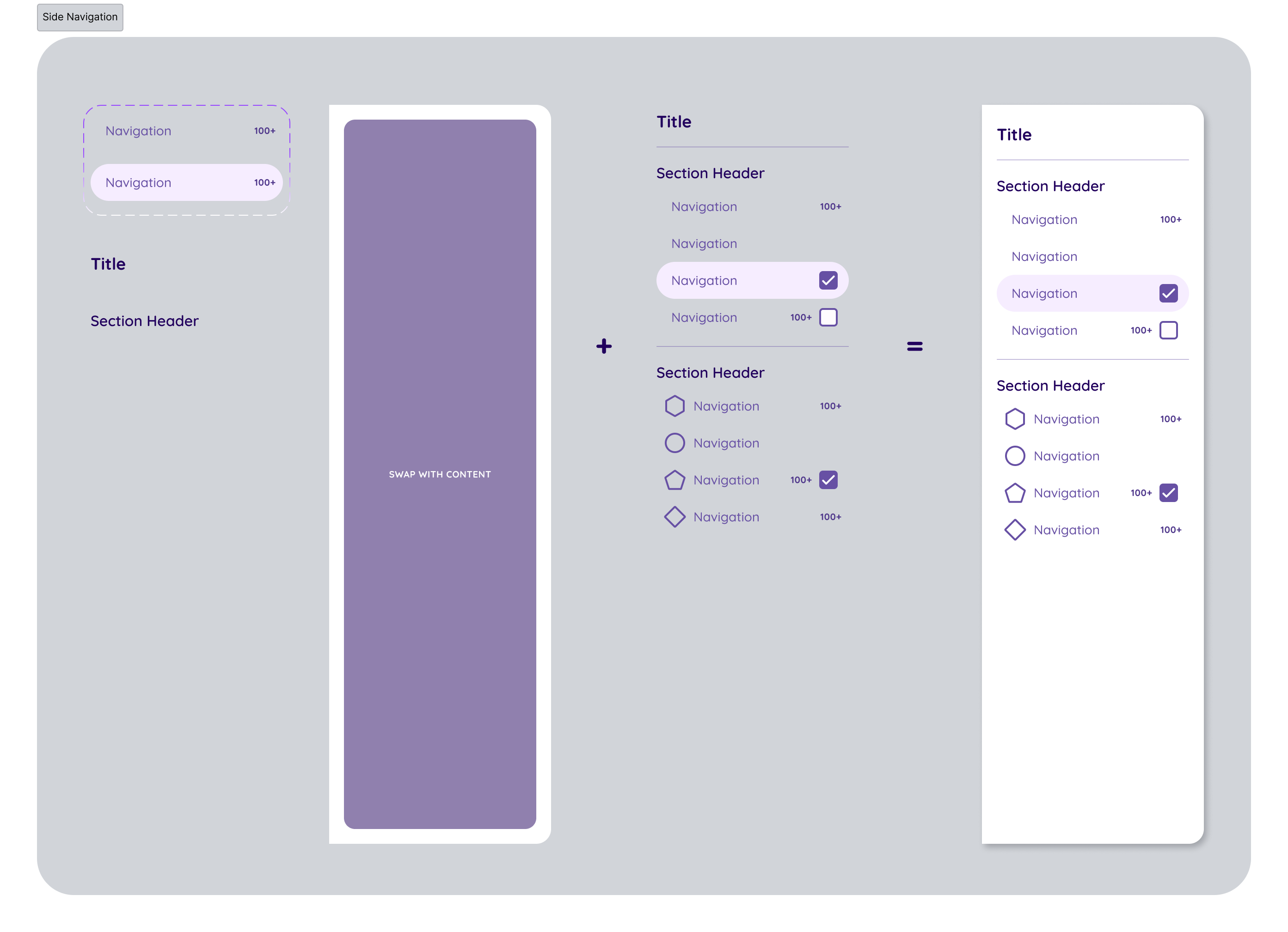
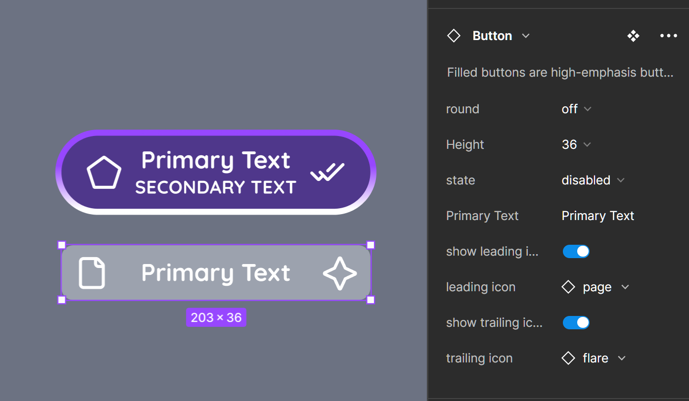
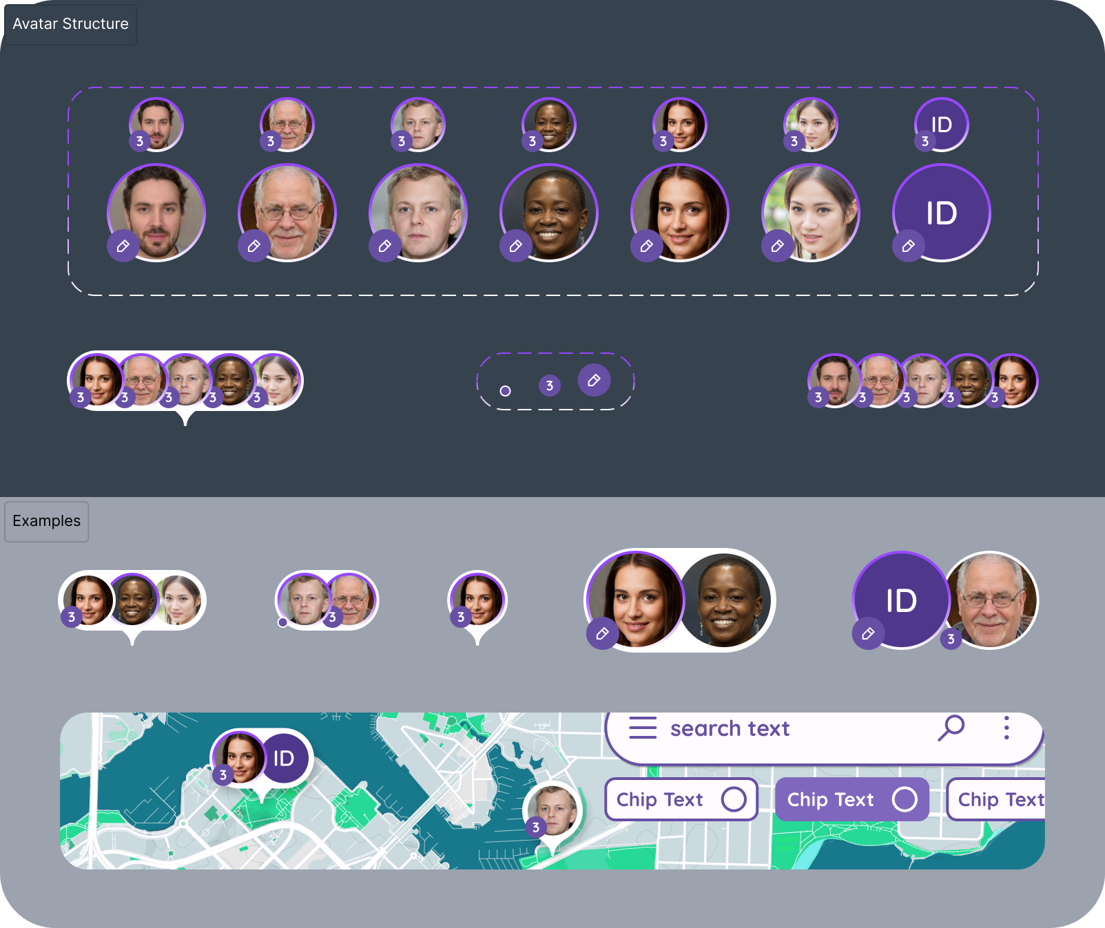
About this Design System
In the dynamic world of UX/UI design, the need for rapid prototyping is more crucial than ever. To address this, I’ve developed a meticulously crafted, mobile-first design system in Figma, tailored to accelerate the creation process while maintaining consistency and quality in design. This system isn’t just a tool; it’s a testament to the principles of atomic design, enabling me to construct, iterate, and evolve interfaces swiftly and systematically.
Core Features
Mobile-First Approach: Designed with a mobile-first mindset, the system prioritizes components and patterns essential for crafting intuitive and effective mobile experiences. This focus ensures that the most crucial elements are not just responsive but are primarily optimized for smaller screens.
Monotone Aesthetic: The lo-fi, monotone aesthetic is intentional, serving to strip down distractions and place emphasis on functionality and structure. This approach allows for rapid ideation and testing without the initial bias of intricate color schemes or graphics.
Atomic Design Principles: At its core, the system is rooted in atomic design methodology. It breaks down complex components into basic elements, promoting reusability and scalability. From atoms to molecules and organisms, each component is thoughtfully considered and designed for flexibility and reuse.
Dynamic Variables: Central to the system’s adaptability are the dynamic variables integrated within. These variables control properties like color, spacing, and typography, ensuring that changes are consistent and global. With just a few tweaks, the entire look and feel can be altered without manually adjusting each component, making the system extraordinarily flexible and efficient for rapid prototyping.
Elevation & Typography: A well-defined elevation system and comprehensive typographical guidelines are built-in, ensuring clarity and hierarchy are maintained across all designs. These systems provide a structured way to convey depth and importance, crucial for user comprehension.
Stateful Components & Placeholders: Components like buttons and cards come with various states (default, active, disabled, etc.) to reflect user interaction and system feedback. Additionally, placeholder components marked “replace with content” are ready to be swapped with specific content, making the system highly adaptable to different contexts.
Extensible Navigation Elements: With components for bottom sheets, side navigation, and more, the system is equipped to handle a wide range of user navigation patterns, ensuring that users can move through apps seamlessly and intuitively.
Future Plans
Responsive Expansion: While currently optimized for mobile, plans are in place to expand this system to tablet and desktop interfaces. The foundational work has been laid, ensuring that scaling up to larger screens will maintain the system’s integrity and usability.
Dynamic Adaptation: As projects evolve and new needs arise, the system is designed to grow. New components and patterns will be added, always adhering to the underlying principles that make the system robust and reliable.
Conclusion
This design system is more than a collection of components; it’s a framework for thinking and a catalyst for creation. It represents a commitment to efficiency, consistency, and design excellence. As it evolves, it will continue to empower rapid prototyping, ensuring that ideas can be brought to life swiftly and effectively. Explore the images to see this system in action and envision how it can streamline the journey from concept to prototype.